Foundation Website Redesign
The Chicago Foundation for Education (CFE) funds Chicago Public School teachers in the most disinvested neighborhoods in Chicago, Illinois.
CFE has been established for over 35 years and they decided it was time to refresh their online presence.
My Solutions:
streamline, simplify, make responsive
focus the content on the user
establish design standards
utilize free or low-cost resources
Website Issues:
built on complicated/outdated technology (also not mobile-friendly)
poor user experience
doesn't accurately reflect their brand
no design standards
cost
The Platform
CFE was paying a lot of money to a second and third party for an outdated and complicated website.
I wanted to give them something so user-friendly that they didn’t have to rely on someone outside the organization to do future website updating.
Setting them up with a Squarespace website saves them money, saves them time, and gives them autonomy.
Homepage
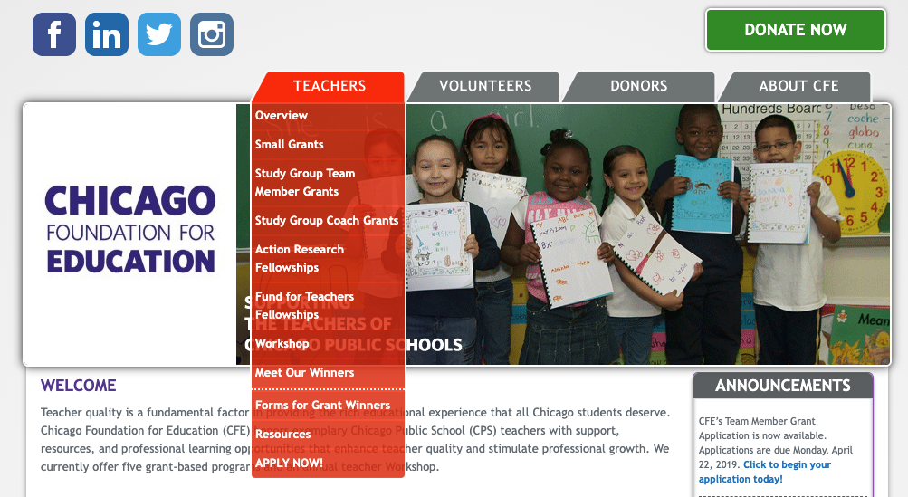
Old Design
Some visuals to update:
use of white space
limit the color palette - 4 main colors are not needed
visual hierarchy - lessen and rearrange the content and messaging to focus the user
navigation dropdown

I wish there was more focus on the educators and students.
- past Teacher of the Year winner
It’s a bit convoluted.
- Board Member
Research
There are three main users who visit this site:
Educators
Volunteers
Donors
After interviewing and surveying teachers, volunteers, and donors who are involved with CFE and who aren’t, I developed three user profiles.
Mapping out their user journeys helped me decipher information architecture, visual hierarchy, and appropriate content to utilize.
Style Guide
I previously worked at CFE as the Grants & Office Manager so I was familiar with the brand colors and knew concrete design standards were needed.
To help me with design, I interviewed Board Members, teachers, volunteers, and staff who've been involved with CFE for at least three years to understand how they perceived the nonprofit's brand and digital look.
Final Product
mobile-first design strategy
focused color palette
focused content
straightforward CTA buttons
visual hierarchy
scaled and proportioned
condensed menu items
clear mission and brand


