
International Museum of Surgical Science
An E-Commerce Redesign for the Macabre
The Brief
design a medium-fidelity, clickable prototype around a desktop online shopping experience
meet the goals of the business/brand
meet the goals of the user
follow IA heuristic best practices
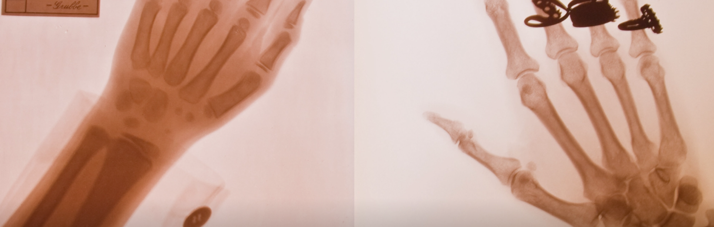
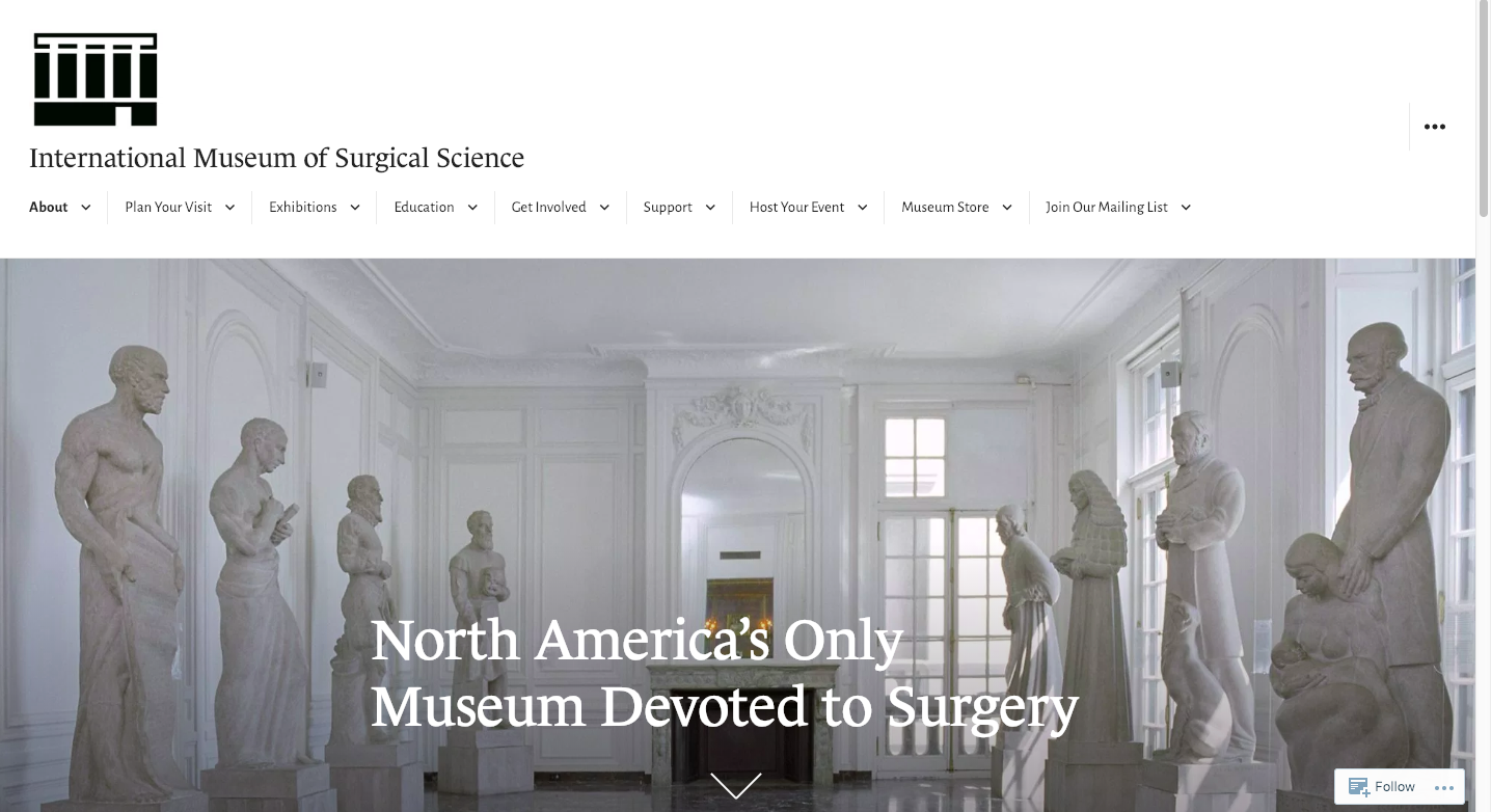
The International Museum of Surgical Science (IMSS) is an extensive public gallery committed to the history of surgery and contains a permanent collection of art and artifacts from the history of Medicine.
IMSS is the only museum of its kind in North America… and they only sell totally off-the-wall products in their gift shop.

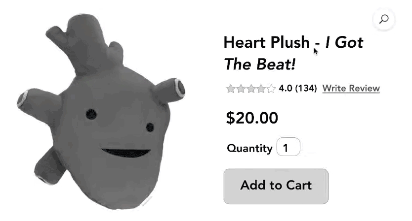
kneecap Plush
Goals
Translate the appreciation and education of the museum into a digital experience
redesign the website so the mission and brand connect users with the unique collection of art and artifacts
bridge the gap between the sterile medical exhibits they showcase and the light-hearted products they sell
Ease the user’s shopping experience

Colon Plush
Research
Surveys:
ages 24–60
online
one on general museum experiences
one specifically about the IMSS
Interviews:
ages 24–60
in person
via Zoom
over email
affinity mapped for synthesizing and insights

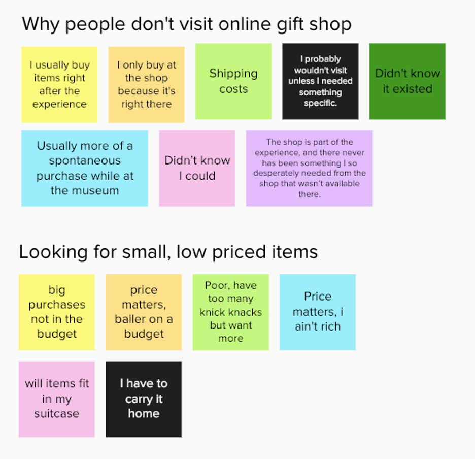
General Insights
People purchase from the physical gift shop because it’s convenient, spontaneous, and directly correlates with their experience of going through the museum.
People tend to purchase small items that are cheaper and easy to carry home at a physical museum gift shop.
Hardly anyone is aware items in the gift shop are online, therefore they don’t extend their museum experience once home.
IMSS Insights
People purchase small items from the physical gift shop because they are affordable and unique, reminding people of the medical exhibitions in a light-hearted way.
People aren’t aware that items in the gift shop are available online, therefore they don’t extend their museum experience once they get home.
Once aware, people said they would buy items from the online gift shop because they have amusing products that give the sterile field of medicine a light touch.

Developing
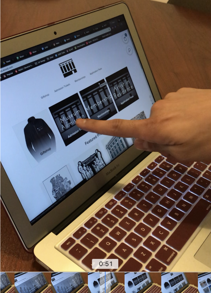
User Observation / Usability Testing
watched a user explore the current IMSS website
tracked them purchasing an item from the gift shop
user talked me through their process
deduced the ease (or lack thereof) of this process
Visuals & Clickability
homepage is cold
no easily accessible unique exhibits OR purchase items
text-heavy
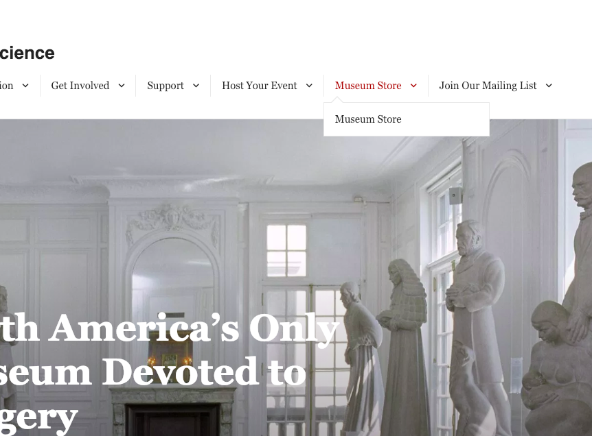
Museum Store tab has redundancy
Museum Store page is titled differently than in navigation
IMSS logo in header doesn’t link back to homepage
No consistent navigation bar across the top of these pages
laborious


Sitemap
Original site architectural observations:
overloaded: depth and breadth is overwhelming
too many tabs in the navigation
unclear navigation
ambiguous titles
Solution
Re-organize and simplify the IMSS website so:
the unique exhibits are accessible and stand out
make purchasing a quirky medical-themed gift personable and easy
Proposed Sitemap
Architectural changes (only officially updating the :
condensed navigation
combined similar topics
more accessible exhibitions
more accessible shopping
reorganized shopping categories
nested purchase items un-related to the gift shop under their appropriate tabs (ie admission tickets)

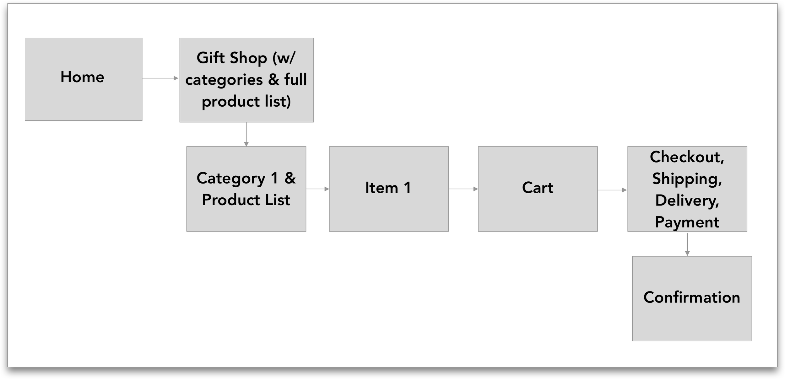
Purchasing a Product Flow
Original flow

Proposed flow

Deliverables
Tested and iterated wireframes of:
Homepage
Gift Shop main page
Plushy Organs product list page
Singular product page
Cart page
Checkout page
Confirmation page
Features simplified for the e-commerce process:
straightforward CTA buttons
micro-interactions that confirm the users’ actions
express checkout option with a PayPal integration
Clear order confirmation and next steps
Medium-fidelity Prototype

Next Steps
I would love to continue exploring their e-commerce from the inside and developing a more in-depth way to make their online gift shop a main revenue stream.
I also heard from user testing that no one knows what the logo is ( it’s a very rudimentary icon of their building). Were I to continue with this project, I would like to initiate a re-brand for logo and colors (along with lots of user testing). I’d like to create a Style Guide for IMSS to define consistent design standards and add more distinctive branding.

